Julie and Julia and Lisa’s Kitchen
 This past weekend I saw the movie Julie & Julia with my two sisters. We all met in Boston to celebrate our combined birthdays. Dinner and a movie in the city. Perhaps a little late night dancing if we were up to it afterwards. We have traditionally gone out to the Burlington area, since that is a midpoint for all of us to meet, and eat dinner first and then rush to get to the movie. This time, not only would we change locations, but we would also change the order of our evening. We decided to see the movie prior to eating dinner so that we would have even more to talk about as we dined!

Leslie, Elizabeth & Lisa
How, you might be wondering does this blog entry relate to the previous topics I have blogged about regarding interior design or even green interior design? I am not sure, but I am hoping that if I keep writing, something karmic will occur that will connect two of the creative outlets in my life. Interior design and food!

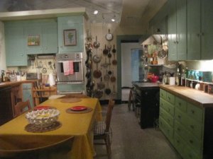
Julia Child's kitchen
As I watched this movie, I did experience an insight that I will share. Towards the end of the movie, (I won’t give the ending away!) they show Julia in her Cambridge kitchen. I elbow my sister Leslie and whisper to her to take a look at Julia’s kitchen cabinets. They are not natural cherry, walnut nor maple, they are a painted finish. In addition, they are painted two different colors. The upper cabinets are a soft blue and the base cabinets are a green. Her counter tops are butcher block, with the kitchen table in the center of the room. And who could forget the pegboard with the outlines of the pans drawn by her husband! It was the cabinets that made me elbow my sister. The reason being: my kitchen cabinets are painted exactly the same colors! Maybe not exactly the same, but I had used C2 Jamestown Blue for my upper cabinets and C2 Terrapin Green for my base cabinets.

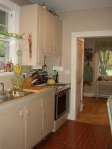
before image of my kitchen
Do you think that twenty years after watching week after week of this program and admiring Julia’s kitchen and cooking skills I had subconsciously put those cabinet colors into my mind waiting for the opportunity to cover my doors with them? When we had moved into our home in Hamilton, the kitchen cabinet doors were painted Benjamin Moore’s White Dove. I immediately slapped paint onto them. However, it wasn’t the colors that I have shared with you. I had first painted them Benjamin Moore’s Iced Mauve, a soft grayish purple. That lasted a few months before I changed it. What was I thinking? Purple was great in the bathroom, bedroom or even a hallway, but it just wasn’t working in the kitchen. Then I painted on two tones of warm taupe. The lighter color going on the walls as well as the upper cabinets and a deeper tone in the same family of color going on the base cabinets. This was better, but not good enough. It was an uninspiring atmosphere to be attempting to create wonderful recipes.
This was going to require some more thought and effort. I had to treat my home the same way I do for my clients. I needed to look at the whole picture and not just a quick fix to add some color to a plain cabinet front. My inspiration, at least this is what I had believed was where the color scheme had come from at the time: was my love for living near the ocean. Actually, any body of water. There was the color of the shore with the plants of the dunes, the wooden boardwalk, the sand, that point where the waves crash along the shore and create white frothy foam, the color of the ocean, the color of the seaweed in the ocean and the color of the changing sky. Blue, beige, white, and green would be the main colors, with small accents of orange, yellow and red (as seen in a setting sun) coming into play with fresh flowers and accessories. That was my palette. And, as I realized this weekend, it was for Julia as well.

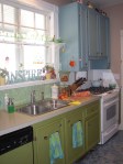
after image of my kitchen
I kept the warm light taupe that I had already painted on the walls (that could represent the sand). It was a comforting background without being as boring as white walls. My husband then added some creative molding to the cabinet doors to give them a bit more definition and detail. We also added new brushed nickel hardware for the knobs, pulls and hinges. Then, some sanding, priming and the final paint color on the cabinet doors and frames. I was now almost able to enjoy being in this space to cook and entertain for family and friends.
I must confess, the worst problem in this kitchen wasn’t the cabinet or wall colors, it was the flooring. We had inherited a kitchen with that aged vinyl flooring in the large brick pattern. There were some bare areas where old cabinetry had been removed and we had exposed sub floors, along with the peeling up of edges near the doorways. I hated this floor. I pretended it didn’t exist. It didn’t look clean even after scrubbing it. It was so old and gross that I didn’t allow my gaze to go below the height of the chair seat. I tried not to notice that horrid brick color.

new kitchen flooring
As an interior designer, I have access to many showrooms and dealers for flooring. Since the first day we moved into our home, I had been searching for a kitchen floor that not only would be visually interesting but would also be within the budget we were working with. I loved Marmoleum and looked into using that. We just couldn’t afford it at the time. The rest of the house had beautiful original 100 year old hardwood floors. I didn’t want to duplicate that, I wanted something different. The inspiration came when we were having dinner at our good friends’ home and I went to check out their kids’ new bathroom flooring. They had purchased it at Lowe’s. It was stunning! It was a ceramic tile that measured 3” x 3” and was a funky blue pattern that reminded me of oil spots on pavement when the mist creates unique colors and patterns. I had found the ocean for my kitchen! The unusual small scale of the tile was an added bonus since we had some level changes that would not have worked if we had used a larger floor tile.
This same friend had also used a wall paper product called anaglypta on her wainscot in her dining room. It is a highly embossed paintable paper product that reminds me of old fashioned tin ceilings. This became my backsplash for most of my kitchen area. I chose to use small glass mosaic tiles for the area under my kitchen window and above the sink. It offered a waterproof solution to an area that would require just a swipe of cloth to clean it. I painted the anaglypta a high gloss bright white and used a light iridescent green color for the glass tiles. I even found a dinner plate pattern by Corelle that worked beautifully with the redesign of the kitchen.
Bon appétit!
www.pbs.org/juliachild/, www.c2paint.com, www.corelle.com
For any thoughts or questions, please feel free to contact me, Lisa Kawski at [email protected]

Comments are Disabled